
Digital Compliance
Upgrading the JBMD Website to AODA
What We Did, and What Surprised Us
We were already rebuilding big chunks of juiceboxmonkeydesigns.com, so we did the responsible thing and put the whole site under an accessibility microscope at the same time. Not "does it look accessible," but "does it actually pass, line by line."
Here is what we learned taking the site to Web Content Accessibility Guidelines, the technical standard the AODA points at 2.1 AA, the level Ontario's Accessibility for Ontarians with Disabilities Act points at for public-facing sites, and then some, with the real numbers.
Automated tools are the starting line, not the finish line
We ran axe-core across every page type. It is a great first sweep and it caught real problems. But the number worth remembering: automated scanners catch somewhere between a third and a half of actual Web Content Accessibility Guidelines, the technical standard the AODA points at issues. The rest is human judgment. So we built the audit in three layers.
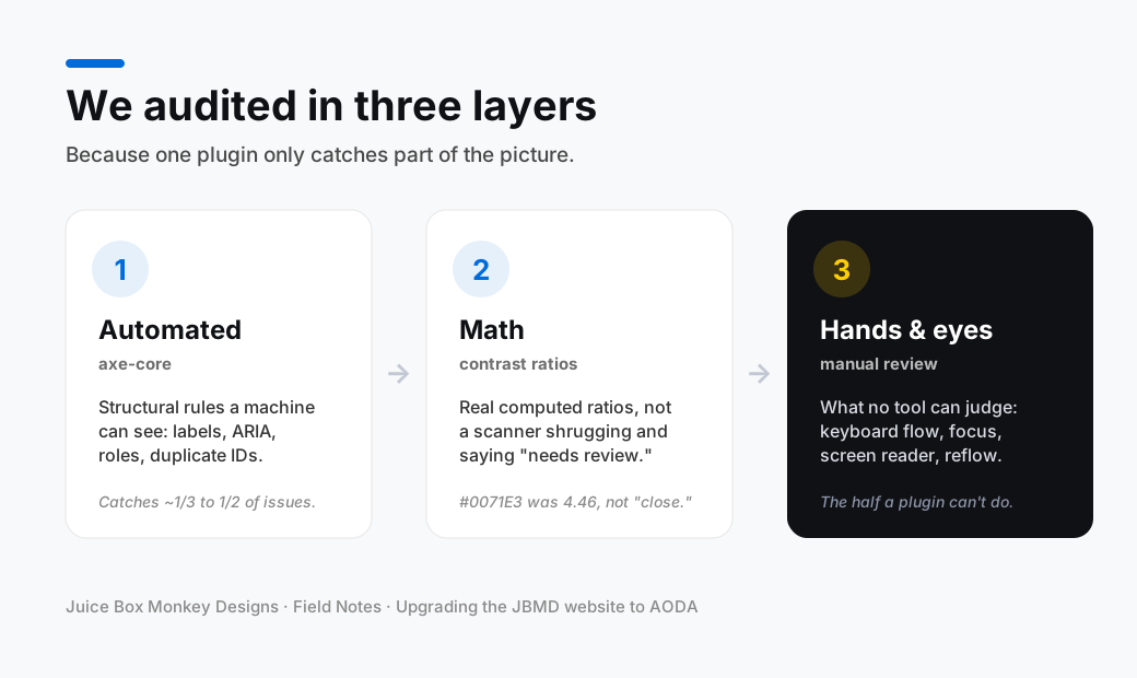
If your accessibility report is a single green checkmark from one plugin, you have not finished. You have barely started.
Colour was the biggest surprise
We thought our palette was fine. It was not, and in ways that were easy to miss.
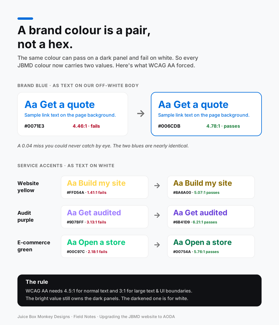
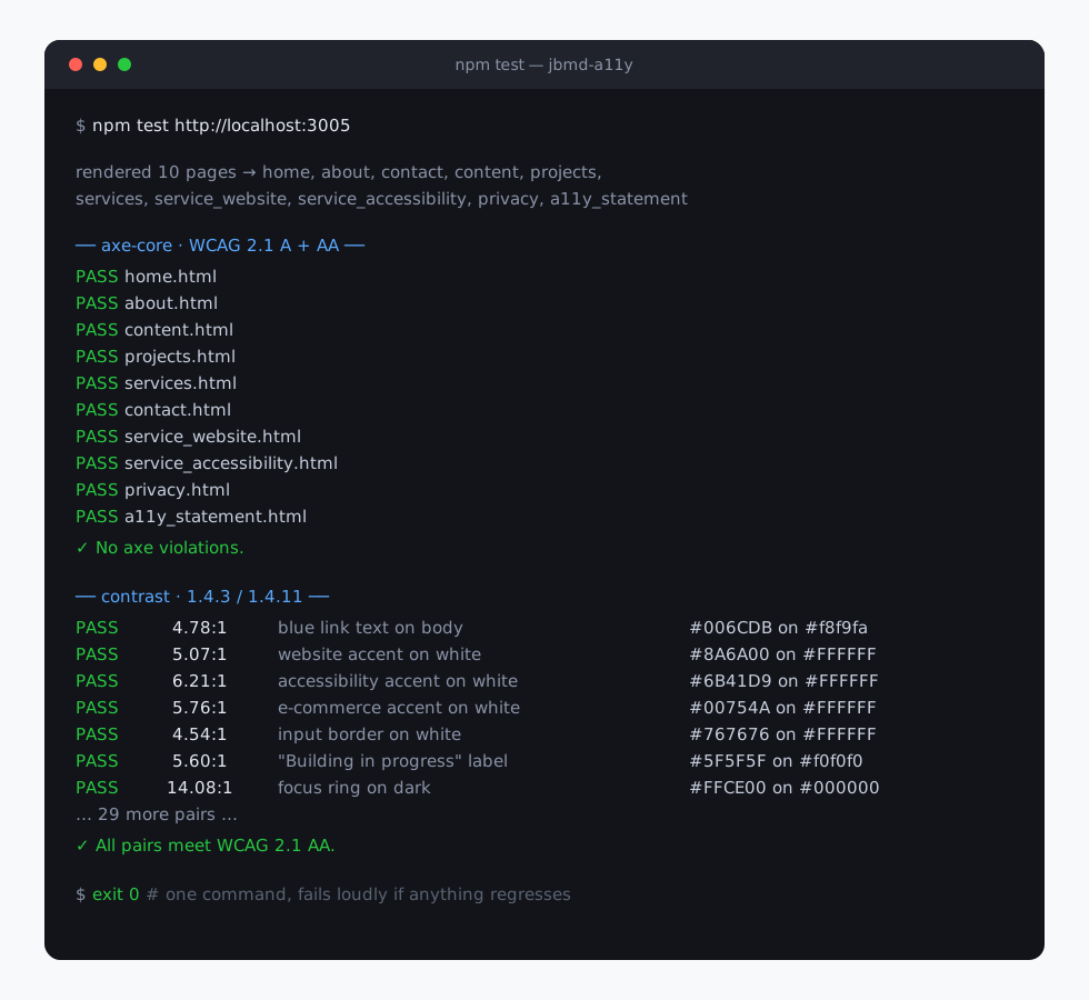
Our brand blue failed by 0.04. #0071E3 on our off-white background measured 4.46:1. AA needs 4.5:1 for normal text. Four hundredths of a ratio point, impossible to catch by eye. We nudged it to #006CDB, visually almost identical, and it jumped to 4.78:1, passing everywhere including white-on-blue buttons.
Our accent colours were invisible on white. The bright yellow we love is gorgeous on a black panel, about 14:1. As text on white it is 1.41:1, which is to say, not there. The purple was 3.13:1, the green 2.18:1. The fix was not to dull the brand, it was to accept that a colour has to earn its contrast on each surface. Every service now carries a pair.
| Accent | On white (before) | On-light variant (after) |
|---|---|---|
| Website yellow | #FFD54A — 1.41:1 | #8A6A00 — 5.07:1 |
| Audit purple | #9D7BFF — 3.13:1 | #6B41D9 — 6.21:1 |
| E-commerce green | #00C97C — 2.18:1 | #00754A — 5.76:1 |
The bright value still owns the dark panels, where it has plenty of contrast. The darkened one handles anything drawn on white. If you take one thing from this section: a brand colour is not one hex code, it is a pair.
A few other contrast misses we swept while we were in there:
- Form input borders were Bootstrap's default #ced4da, 1.5:1 against white. UI boundaries need 3:1. Darkened to #767676 at 4.54:1.
- The "Building in progress" button: grey #6E6E6E on #f0f0f0 was 4.47:1. Bumped to #5F5F5F at 5.60:1.
- Review stats: the "positive" green #00A834 at 3.16:1 became #007A26 at 5.51:1; the reports table total #A3A3A3 at 2.52:1 became #6A6A6A at 5.41:1.
The structure nobody sees
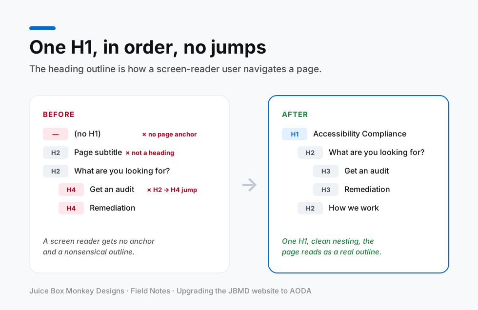
A sighted mouse user never notices these. A keyboard or screen-reader user notices immediately when they are missing. The heading outline is the clearest example: it is how a screen reader navigates the page.
- A skip link. We added a "Skip to main content" link as the first focusable element, with the content wrapped in a main landmark it jumps to. Keyboard users now skip past the nav instead of tabbing through it on every page.
- A named home link. Our breadcrumb "home" was an icon-only link with no accessible name, so a screen reader announced nothing. We gave it aria-label="Home", hid the decorative icon, and wrapped the trail in a breadcrumb nav landmark.
- One H1 per page, in order. We had been using an H2 for page subtitles, competing with the real heading, and jumping H2 straight to H4 in sections. Subtitles became paragraphs, service cards went H4 to H3, and the privacy page got its missing H1.
- Lists that are actually lists. Our card grids and tag groups were stacks of divs. Converting them to real lists means a screen reader announces "list, 6 items." Doing it, we also found stat tags with unclosed paragraph tags, invalid markup that had been shipping for who knows how long.
The contact form
Forms are where accessibility quietly breaks. Ours needed three fixes.
- Errors tied to their field. Each input now points at its message with aria-describedby, so the error is programmatically connected, not just sitting nearby.
- A live region for the result. The "your message has been sent" confirmation appeared visually but was not reliably announced. We added a persistent assertive live region that the script writes into, and moved focus to the message.
- Readable field borders. The same #ced4da to #767676 fix from the colour pass.
Focus you can actually see
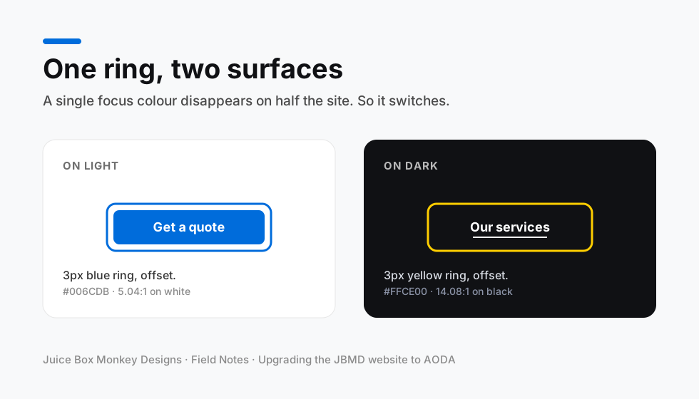
We never hid focus outlines, which is good, but we had been leaning on the browser default, which is basically invisible on our black panels. One focus colour cannot cover a two-tone site, so the ring switches with the surface.
We also added a reduced-motion block, so the smooth-scroll and transitions calm down for anyone who has asked their system for less animation.
The small stuff that adds up
- Reflow. Headings and tags using white-space: nowrap force horizontal scrolling at 320px. Removed from the card titles and tag rows.
- Duplicate IDs. Every "learn more" dialog on our report pages reused the same id. Made unique.
- Unnamed progress bars. The quarterly timeline bars had a progressbar role with no name. Now each one is labelled, for example "Quarter 2, In progress."
- An alt-text typo. "Offical" instead of "Official," copied across 15 review data files. Swept.
How we made it stick
The thing we are proudest of is not the fixes, it is that they will not quietly regress. We wrote a small suite that renders every page type, runs axe-core over it, and asserts about three dozen real foreground and background colour pairs with actual math. One command, run locally from the project, and it fails loudly if anyone reintroduces a problem. Accessibility that is not tested is accessibility that drifts.
The honest part
Passing an automated suite is not the same as actually being accessible. We have done the structural and colour work and verified it rigorously, but the criteria a machine cannot judge still need a human: a full keyboard walkthrough, a screen-reader pass, and a proper 200% zoom and 320px reflow check. Anyone who tells you a plugin made their site "Accessibility for Ontarians with Disabilities Act compliant" is selling you the first third of the job. That manual pass is the work we are booking next, and when it is done this field note gets its follow-up.
Want to know where your own site stands? See what the audit covers, or reach out and we'll get the ball rolling.
Reach outJUMP BACK
All ContentDiscover more content by us